Making It Pretty!
Art is a major element of what draws people in. It can set the game's tone, atmosphere, and also a big part of story telling. Videogames are all just lines of code ran by an engine, dressed up beautifully with all forms of art such as still images, animations, particles, audio, post-processing effects.
In this blog, we will be talking about the visual arts present in this game!
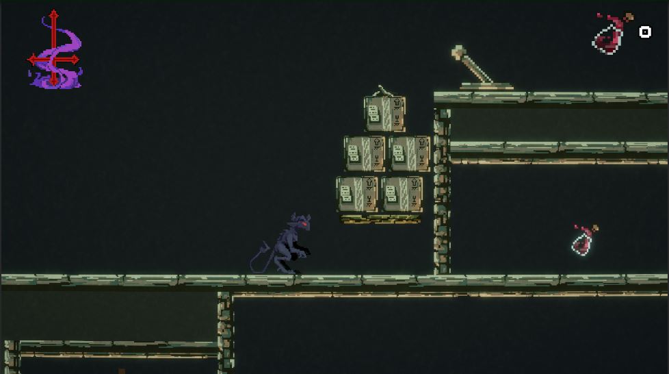
Check out this screenshot below!
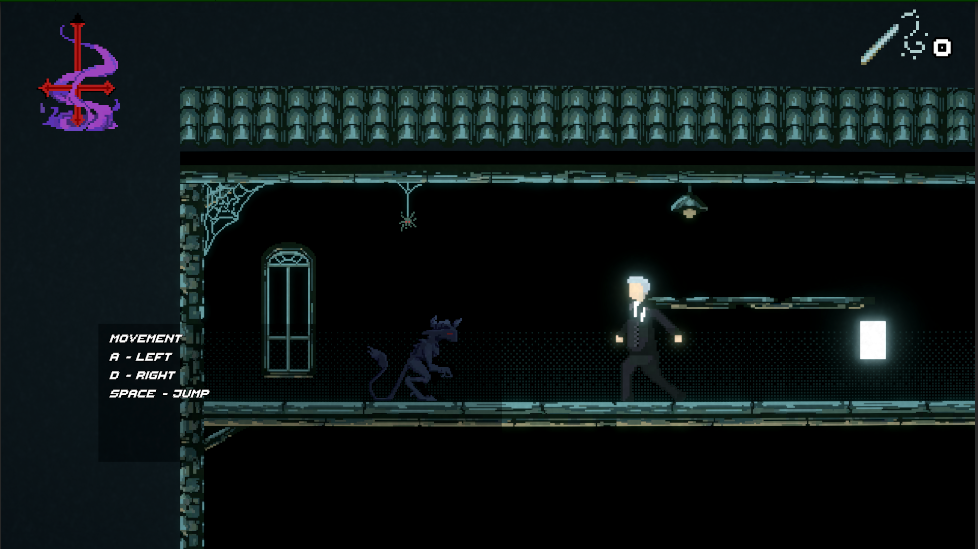
This small scene is composed by so many visual components, such as:
design of characters
environment
animation
UI
particles
post processing
DESIGN OF CHARACTERS:
Designing a main character is always the most important part. Starting from paper sketches, to the final sprite, every step is crucial.
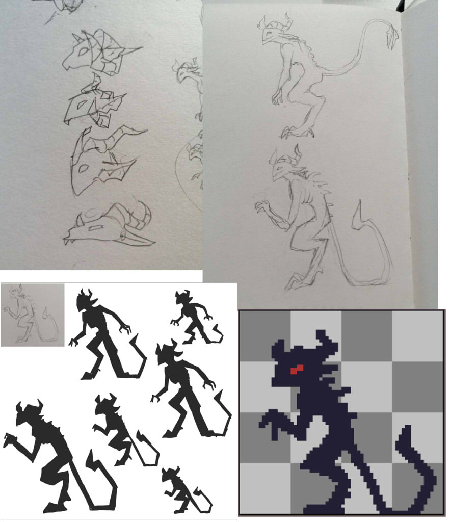
We started by choosing an iconic head shape, and then the overall pose, then refined the silhouette and tested the readability when it is small.

And we ended up with this final design. We kept the colours dark and simple because our main character is supposed to blend in with the shadows.
NPCs:

Same as the main character, we started with a silhouette design, then some more detail sprites.
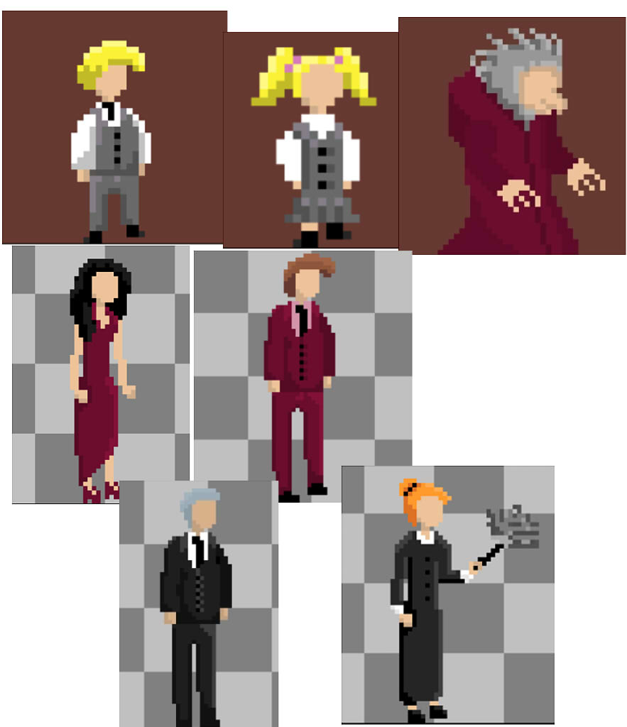
These are the initial designs, some designs will stay the same, and some would be changed.
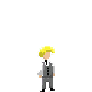
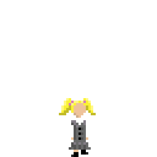
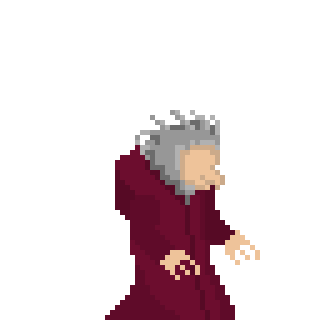
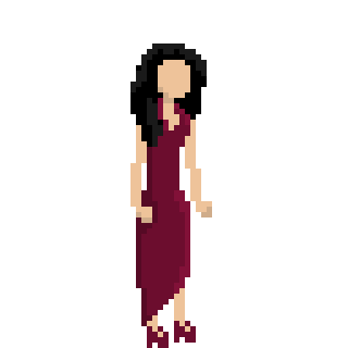
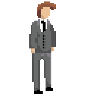
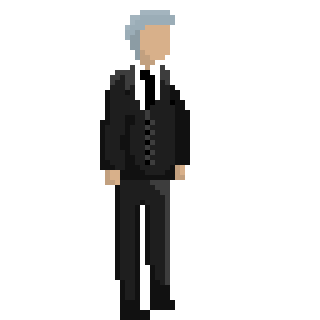
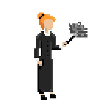
The finalised sprites.
ENVIRONMENTS:
This game features 5 stages, and we thought it would be absolutely sick if we made the colours of each stage go from a cool blue of the attic to a maroon basement, signalling that the further you travel down the house, the closer you get to hell.
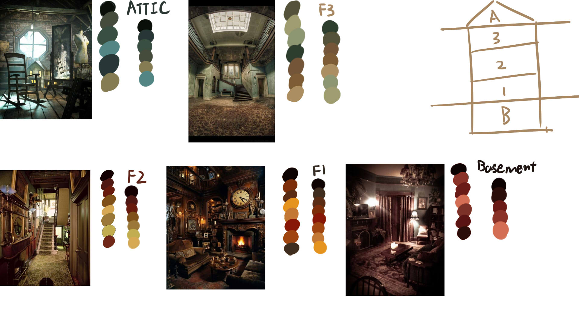
We first found some images, and then picked out some colour for the design


Then we would condense it into 6 colour colour palettes and use these colours to create an environment for that level.
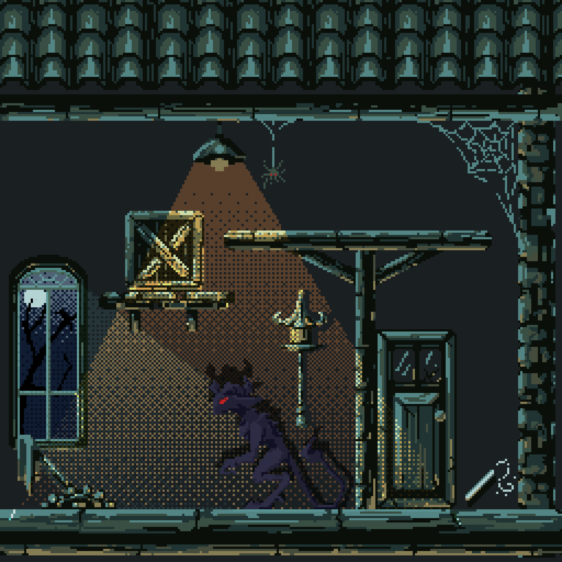
This is a colour tested environment preview, showing how each element may fit into the level, setting an overall common dark blue tone.
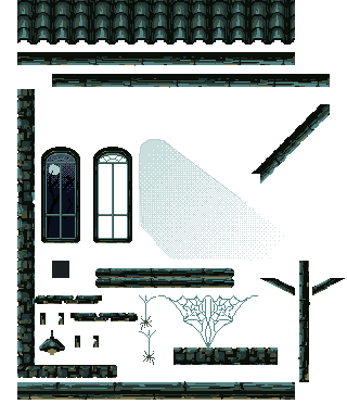
After we all agree on the designs, we turn it into a tile map for Unity, and use it to build our levels.
Animations:
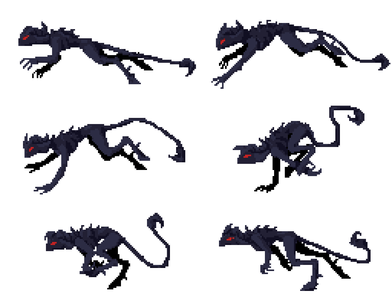
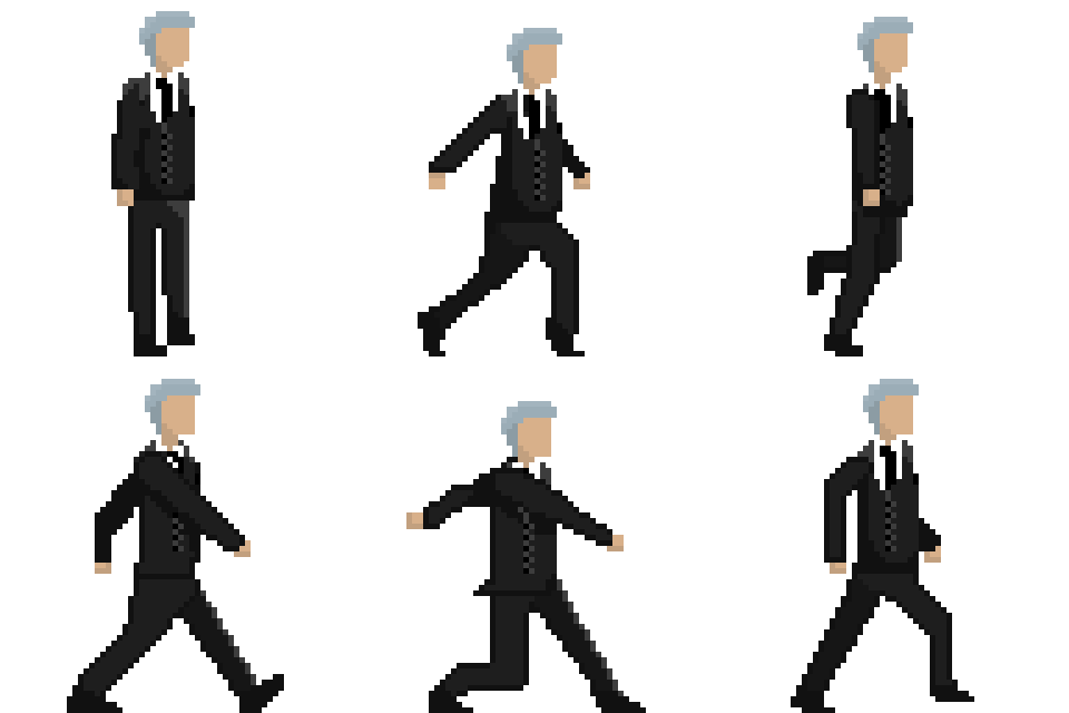
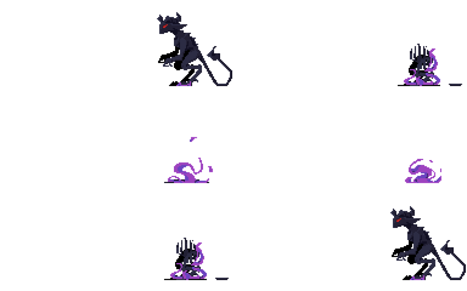
Not only have we created the sprite for the characters, we also separated each limb and element into different layers, and a skeleton version of the player for ease of animation.

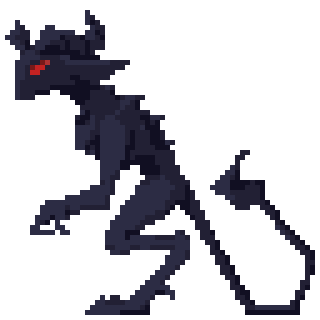
A skeleton is important for keeping the sizing consistent while keeping it rough and simple.
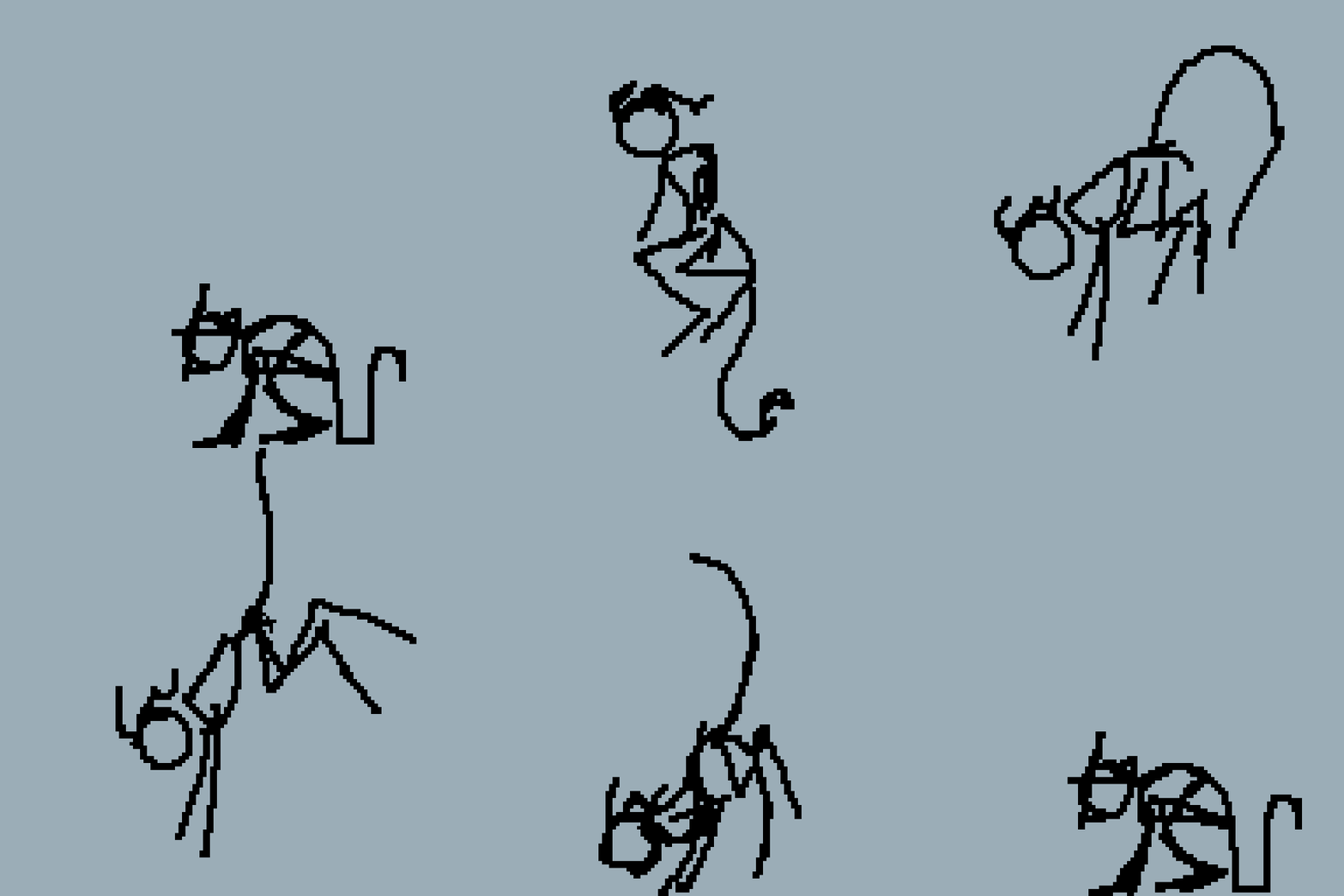
This is a skeleton animation for the player's Jumping animation.
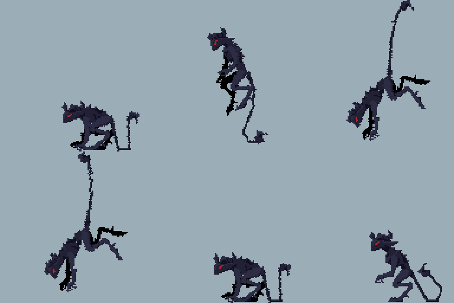
This is a rough uncleaned version of the jump animation done by moving and rotating the different body parts.
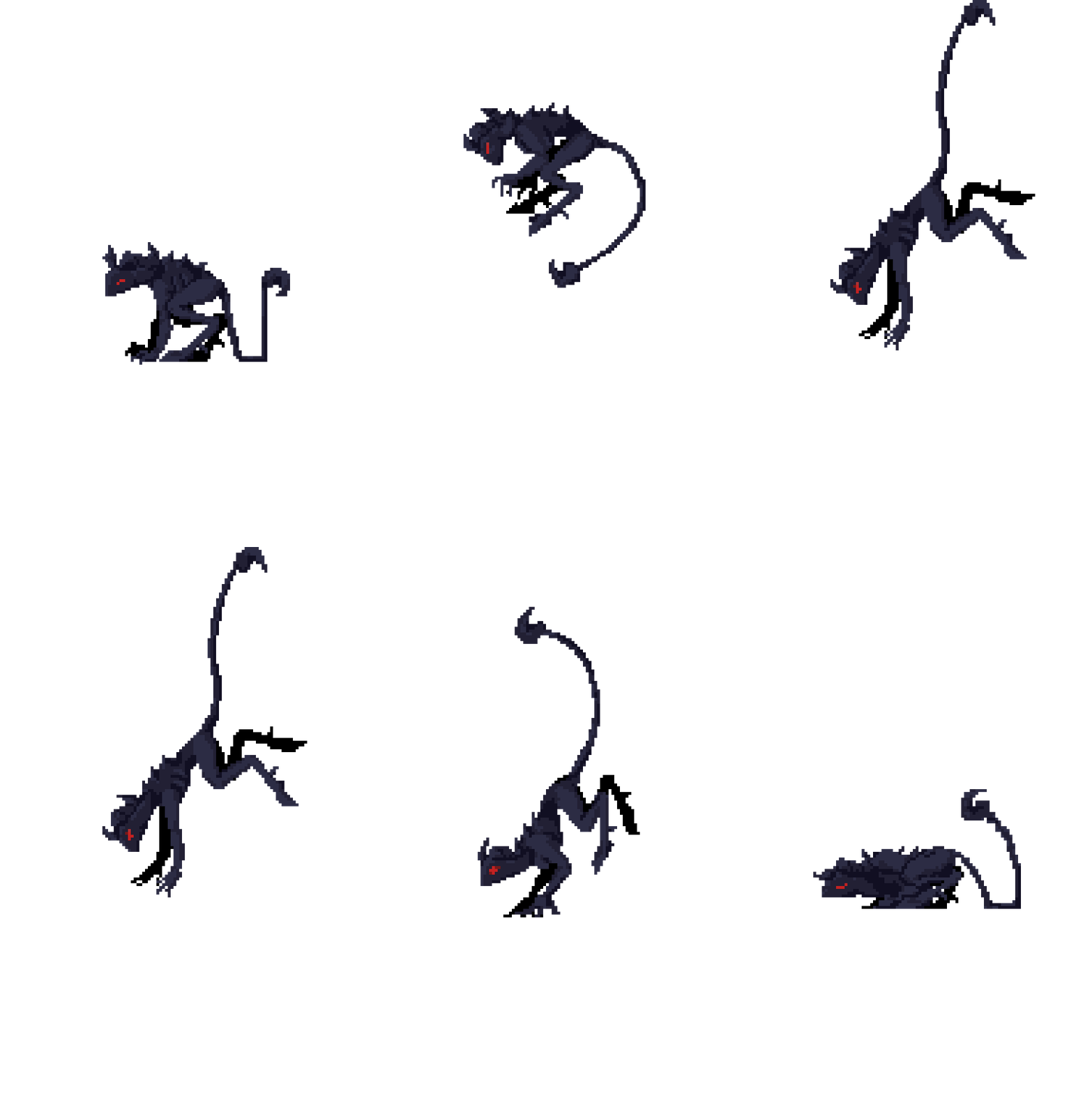
And this is the cleaned up version done by fixing each layer of each frame (phew, it is quite a lot).

After each animation is done, a single long sprite sheet is exported to allow Unity to read and play these animations in game.
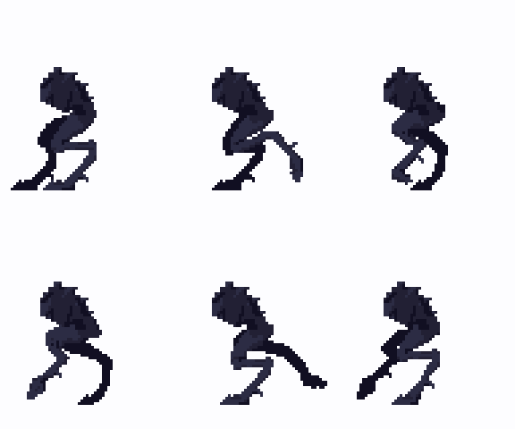
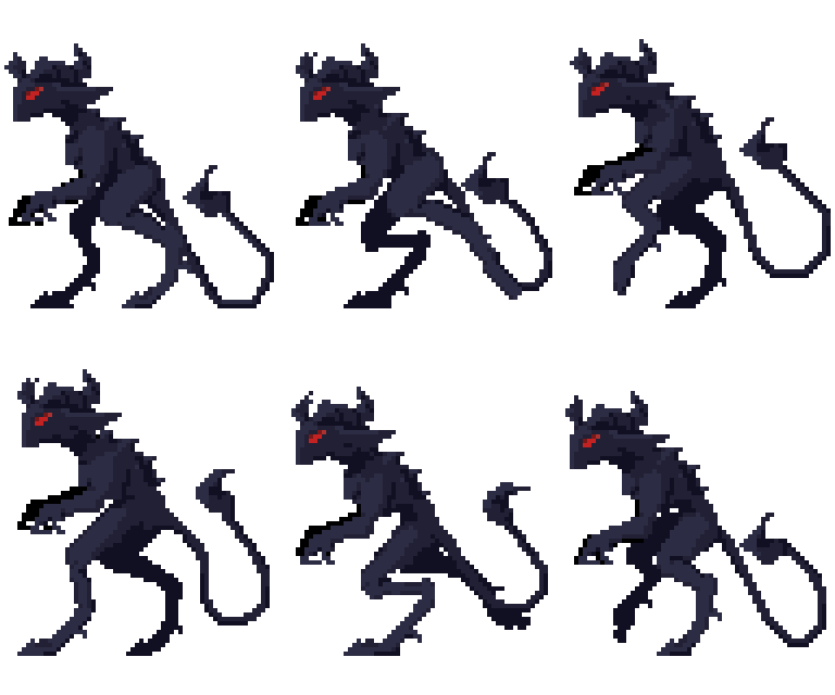
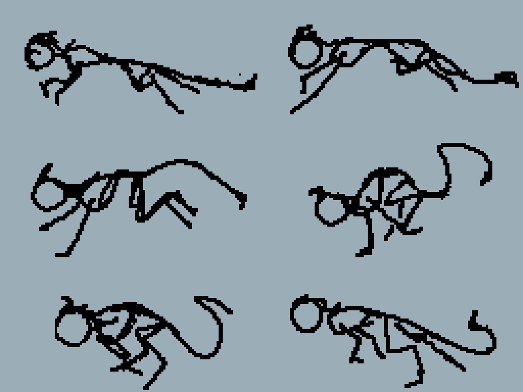
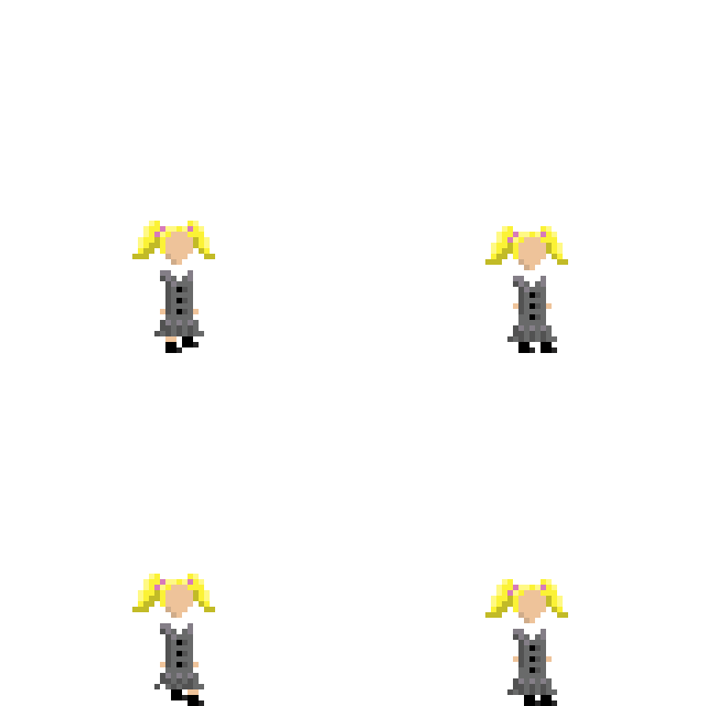
below are some more examples and WIP states of some animations:
UI
UI stands for user interface, it includes things like: HP bar, MP bar, instructions, mouse etc...


The above sprites are representing HP, MP and the mouse respectively.
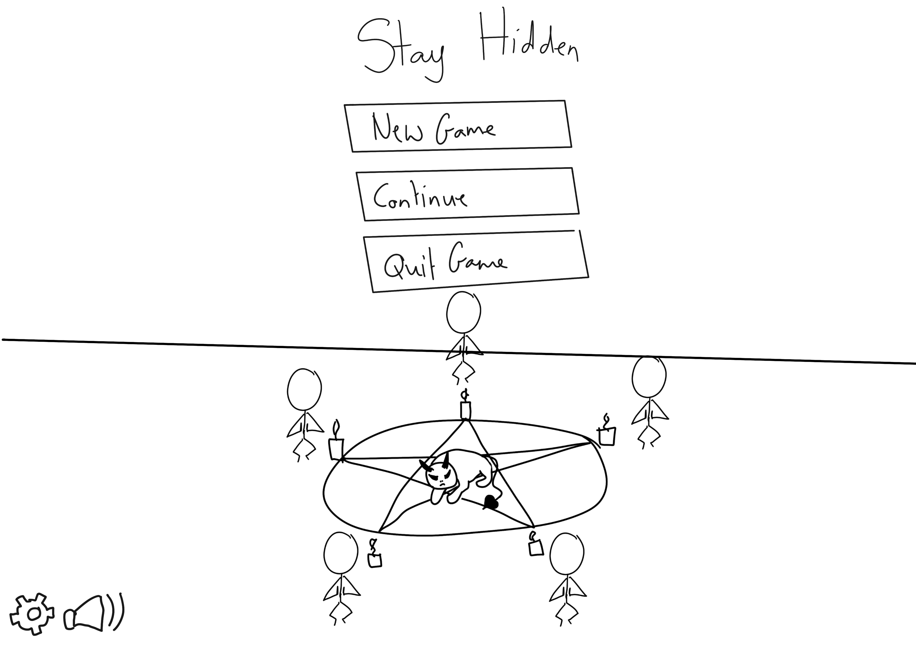
This above is a design for the main menu UI, but later will evolve into something like this:
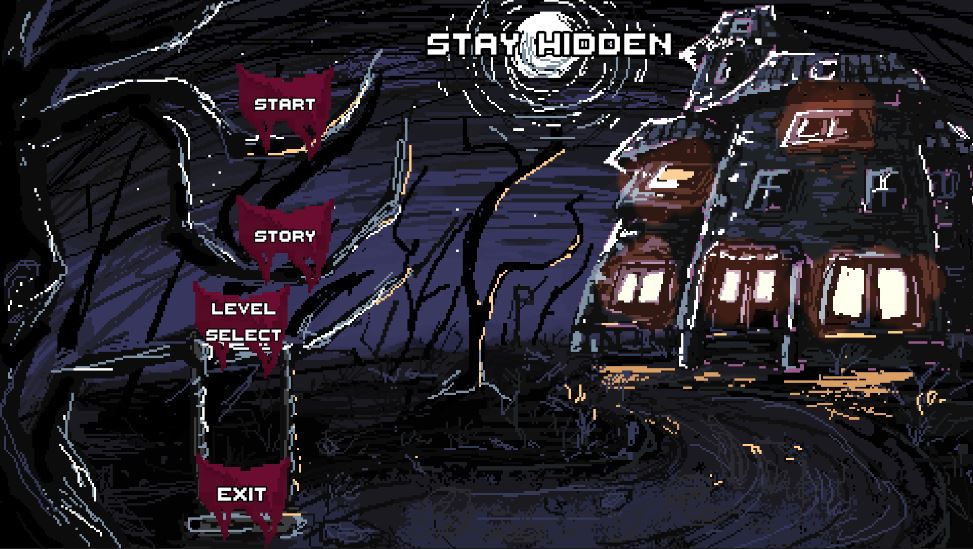
(Not Final)
PARTICLES:
Particles are little bits of extra BOOM and BAM to the game. It is the garnish to the steak. It just makes it look more delicious.
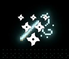
Particles in Unity looks like this in the editing menu.
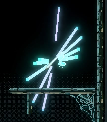
And can be made looking like this when activated.
There are a lot of ways you can manipulate particle effects. you can simulate gravity, pattern and size, allowing us to create effects such as water droplets, flies and other effects without needing to use code or do animations.
POST PROCESSING:
Post processing effects is another layer of visual enhancement done to the game without affecting the game itself. it can include effects such as
Bloom
Noise
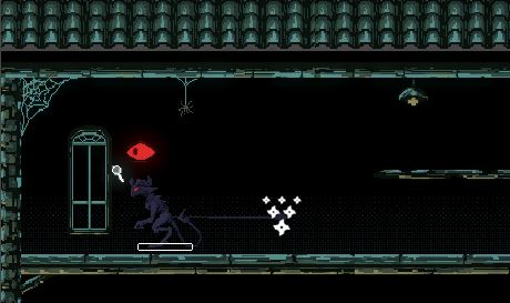
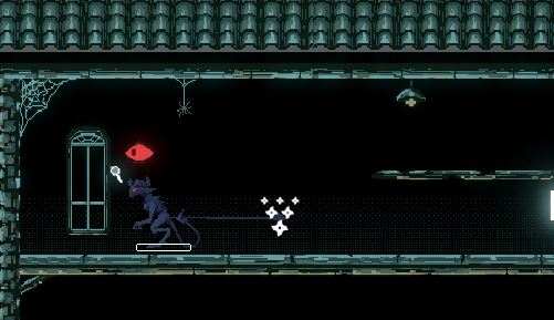
Split toning (colour difference)
Motion blur and many more other effects such as fish eye etc...
Comparison of with and without post processing effects:
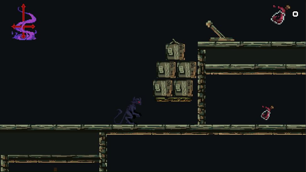
It adds texture and depth to the image, making it less flat and boring.
Unfortunately, this log had come to an end. I hope this Devlog has given you some insight into what goes into the visuals in making a 2D game. Making games takes a lot of passion, time and effort, and I thank our wonderful team for working together to produce this game! All the assets and art for this game are split and done by each member accordingly, and the game is becoming more beautiful with each update!
We will see you soon in the next blog!
Buckle up,
-Yin
Get Stay Hidden
Stay Hidden
Stay Hidden! Get back to your home in hell
| Status | In development |
| Authors | lizthegamedev, SH_Andy, TheMooncheese, Zenua |
| Genre | Puzzle |
| Tags | 2D, cultists, demon, Pixel Art, Puzzle-Platformer, Shadows |
More posts
- Released DemoNov 17, 2024
- The Future of Stay Hidden!Nov 10, 2024
- New version of the gameNov 03, 2024
- 2 days to go for the Let's Break Games event!Nov 01, 2024
- Teaser and Tutorial VideosOct 29, 2024
- We'll Be At Let's Break Games!Oct 28, 2024
- LORE! LORE! LORE!Oct 27, 2024
- Icons, Thumbnails and Graphics DesignOct 24, 2024
- Behind The Code!Oct 20, 2024
- Hunting for Bugs!Oct 09, 2024
Comments
Log in with itch.io to leave a comment.
Wow this is a really good post and extremely informative. The art looks really nice too. I've always had trouble with the art in my games, since I mostly focus on programming. I really like the color palettes too :)
I am so glad it helped you wildcalvino! Are you a solo developer?
Yep, definitely hinders my progress a lot of the time