Icons, Thumbnails and Graphics Design
Along with in game art and animation, graphics design is also important on making the game whole. Things such as icons, thumbnails and other graphic designs will add details that will make the players go "oh that's cool!".
Graphic design itself is a complex topic, and many elements goes into designing each icon and lettering.
The game need a memorable icon for the launcher, so it was my job (art lead) to create some clever designs.
first, I will need to sketch up some ideas, these are often very very rough, because it is pure throwing everything onto a sheet of paper. Lined paper, crumpled A4, back of an assignment, toilet paper, it doesn't matter. 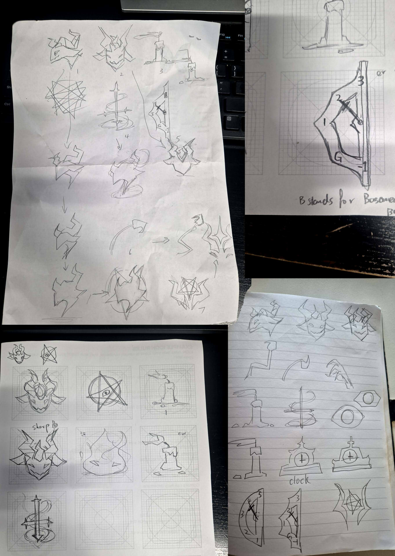
After the sketch comes the testing and refinement. For this part is important to try many variations as possible to explore the design and find something you like.
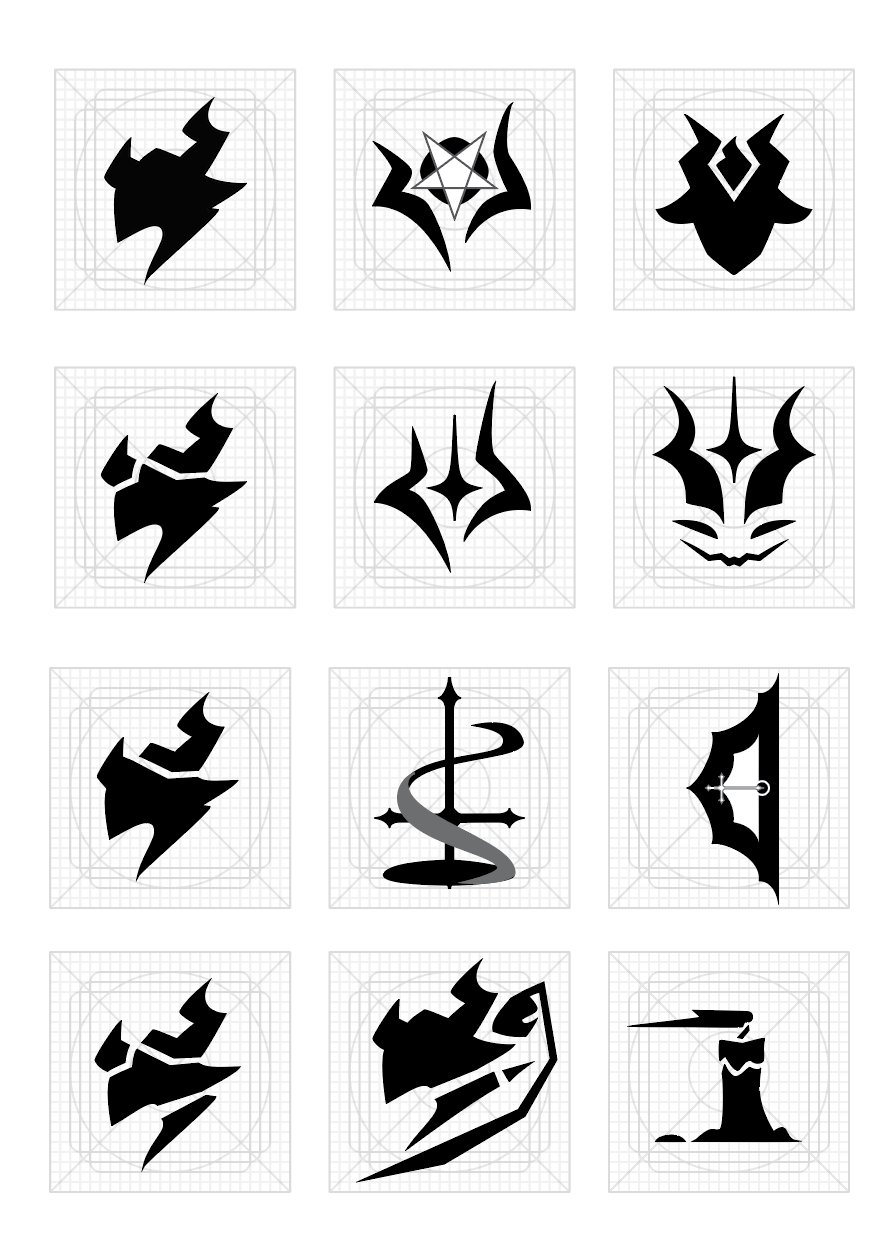
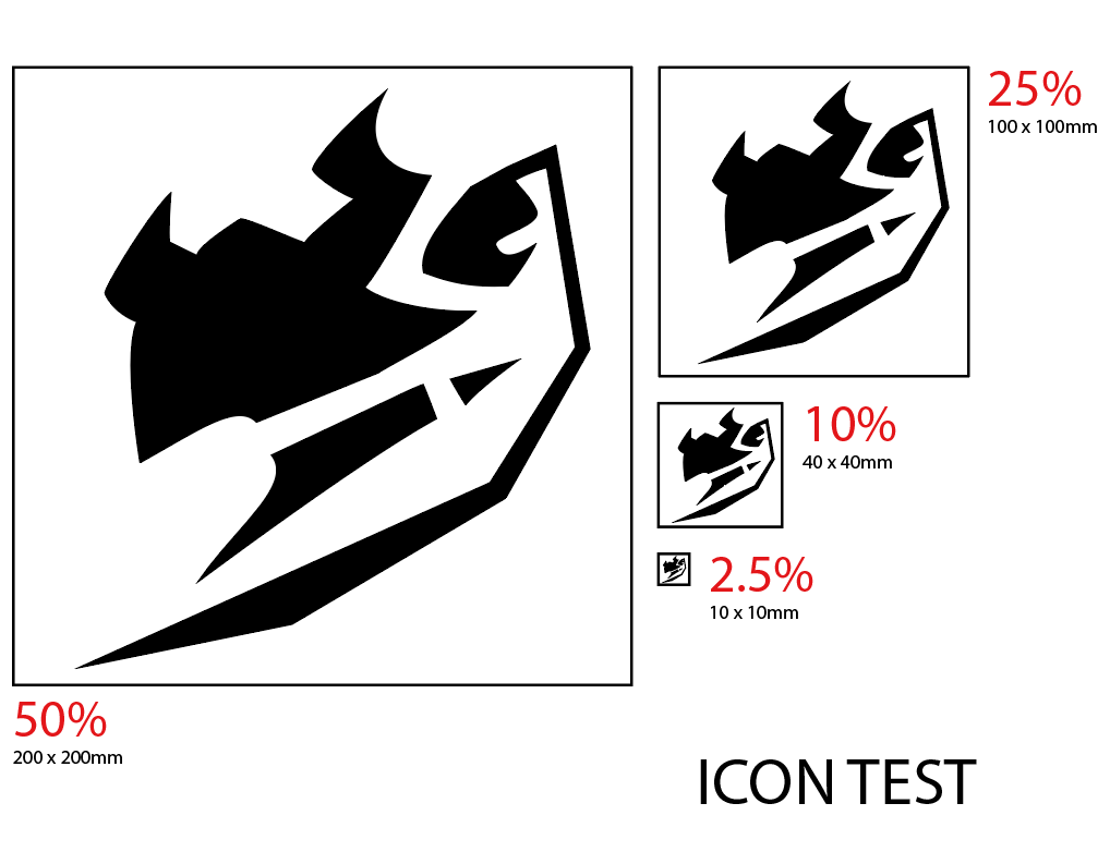
After picking a design, you can choose to colour it. In my case, I have just left it black and white (transparent). You will also need to test the visibility of the Icon, to make sure it has enough gaps and spaces to be readable as a tiny icon.
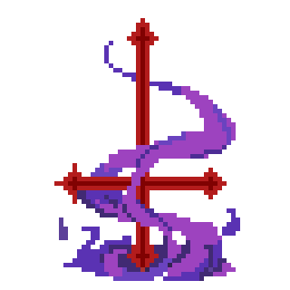
Graphics design also extend to UI designs. For this game, I wanted each element to have a charm to it, such as the unique health and stamina system being as one icon in game.
I am aware that the upside down cross is not truly the demonic symbol, but it is a recognisable one for most people, and that is what we need. I designed the icon as a set of bright image that intertwine with each other. Not only that it saves screen space, but it is also more immersive than the classic bar or hearts.
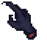
The mouse cursor design is also something I had fun with. I am a huge fan of chopped hand for a cursor, which are prevalent in horror games. One that I remember the most is Fran Bow.
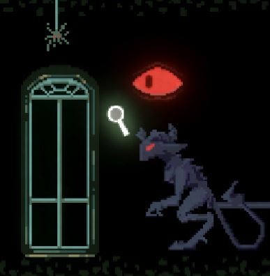
My aim is to make the game as immersive as possible, because immersion makes a huge part of the game. I aimed to use as less text as possible to convey messages, and have added a small magnifying glass to indicate interactables being in range.
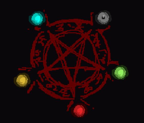
another big one is the level selection design. It is a large pentagram with candles as buttons. each candle will light up depending on if you have unlocked the stage or not.
To sum it up, most icons and visual elements require a certain level of graphics design, and sometimes it comes easy, and other time it can wrack your brain to find a suitable design.
- Yin
Get Stay Hidden
Stay Hidden
Stay Hidden! Get back to your home in hell
| Status | In development |
| Authors | lizthegamedev, SH_Andy, TheMooncheese, Zenua |
| Genre | Puzzle |
| Tags | 2D, cultists, demon, Pixel Art, Puzzle-Platformer, Shadows |
More posts
- Released DemoNov 17, 2024
- The Future of Stay Hidden!Nov 10, 2024
- New version of the gameNov 03, 2024
- 2 days to go for the Let's Break Games event!Nov 01, 2024
- Teaser and Tutorial VideosOct 29, 2024
- We'll Be At Let's Break Games!Oct 28, 2024
- LORE! LORE! LORE!Oct 27, 2024
- Behind The Code!Oct 20, 2024
- Hunting for Bugs!Oct 09, 2024
Leave a comment
Log in with itch.io to leave a comment.